


Click the images above for quick access. Enjoy your time!
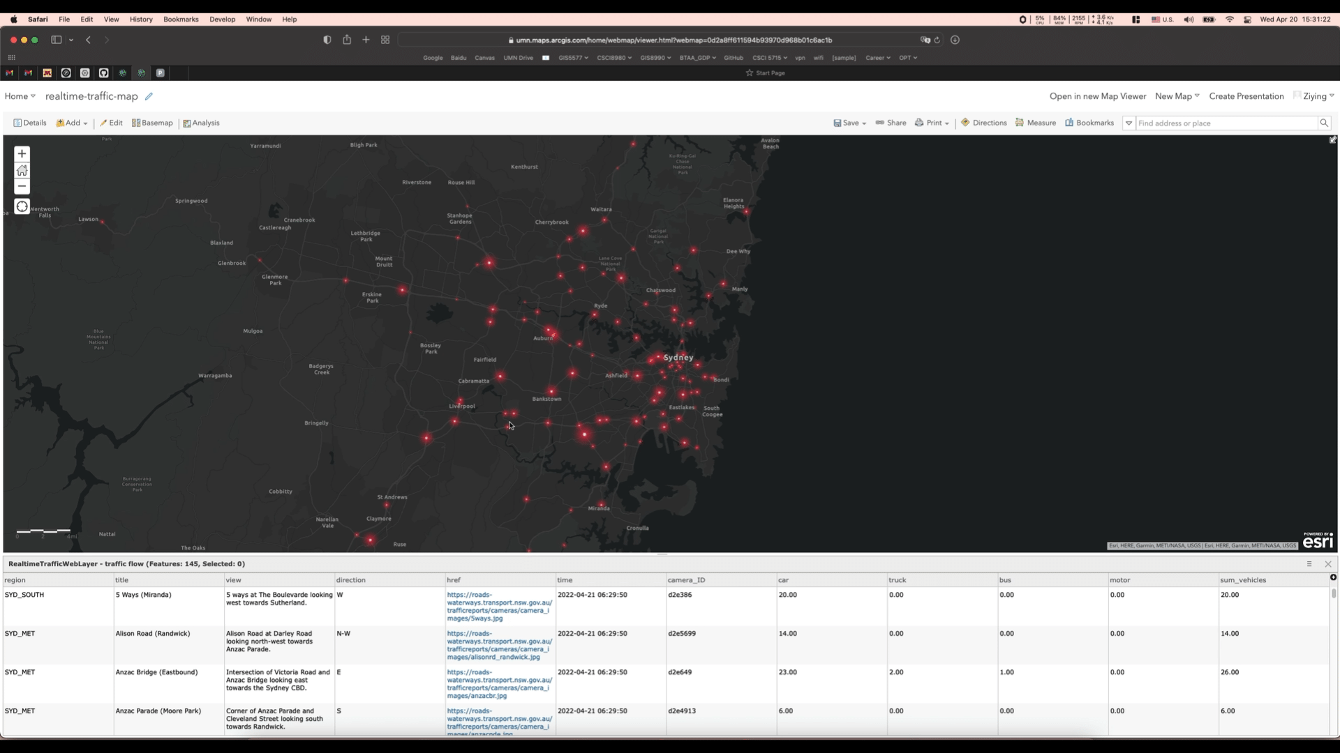
End-to-End Workflow to Monitor Real-time Traffic by Deep Learning
This project aims to use an interactive dashboard to monitor the real-time traffic conditions using object detection model and live traffic images.
Before implement a real-time traffic monitor, train a YOLOv5 object detection model using over 10,000 annotated vehicle images into four classes: car, bus, truck, and motorcycle. Then, create a web map on ArcGIS Online and publish a feature service that provides information about vehicle counts at 86 traffic camera locations. Develop an interactive ArcGIS Dashboard with Arcade expressions that displays live images, road names, and the number of different types of vehicles.
Once everything settles down, start by requesting real-time traffic images from the 86 road cameras. Perform detections on the four target classes, format the output in GeoJSON, and update the feature service using the ArcGIS API for Python. Finally, refresh the web map every 60 seconds to keep the dashboard visualization up to date.

Spatiotemporal Social Sensing on Human Mobility
within TCMA during the COVID Pandemic
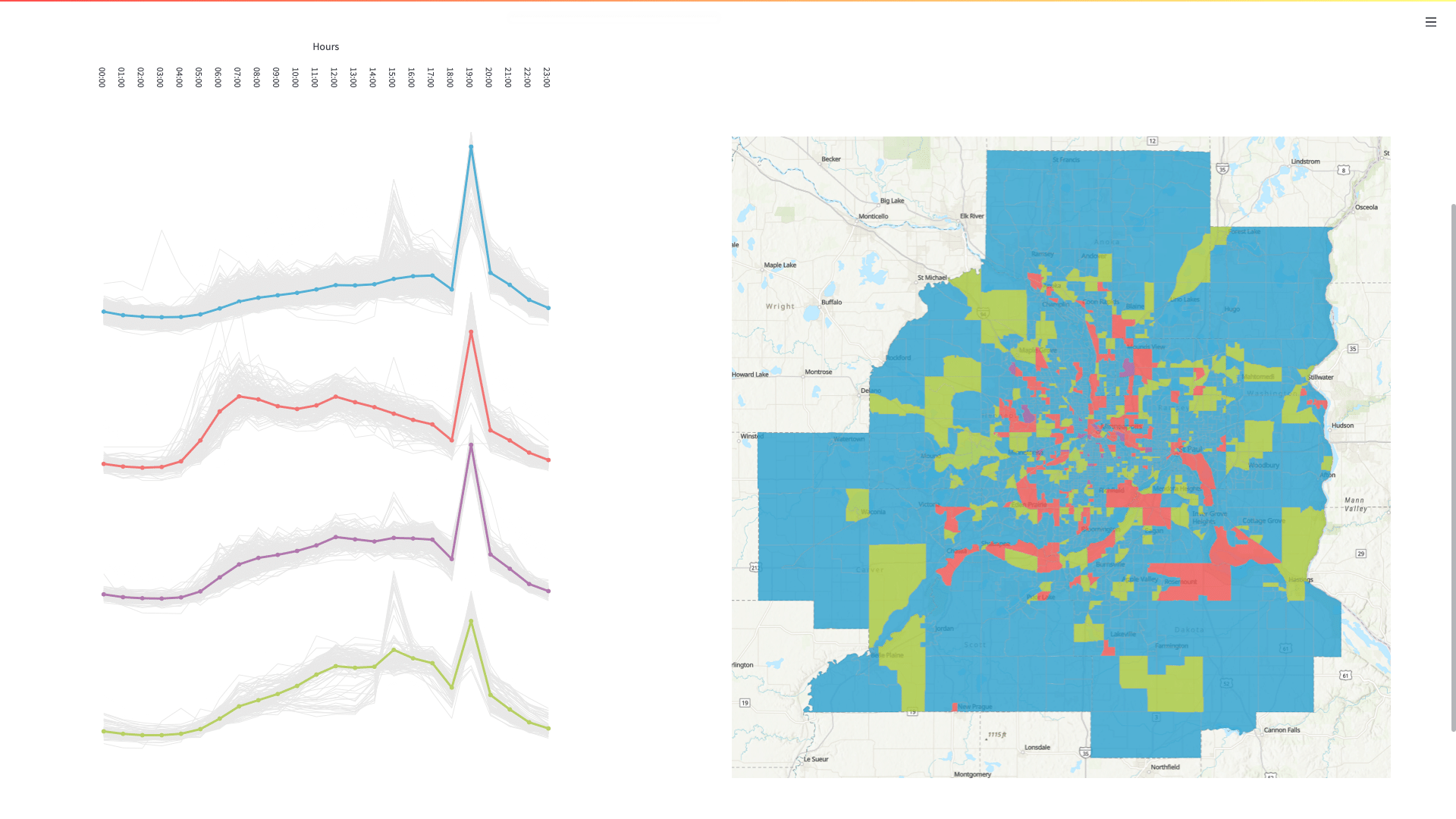
The aim of this project is to characterize the urban spatiotemporal dynamics of the Twin Cities Metropolitan Areas (TCMA) in Minnesota during the COVID-19 pandemic from the perspective of human mobility hotspots. And it mainly focuses on both daily and hourly visits to Census Block Group (CBG) spatial areas in June of 2019 (pre-COVID) and June of 2020 (during COVID). SafeGraph mobility big data and census data are used.
To extract the TCMA mobility records from nationwide records whose file sizes are larger than 10GB, process the mobility data using GeoPandas with the spatial join method in Python. Then, split the single column with an array of 720 hourly stops (24 hours * 30 days for the whole June) into 720 columns representing the hourly visits for later hourly pattern analysis. Finally, aggregate the 720-column hourly visits to 30-column daily visits for later daily pattern analysis.
Use ArcGIS Pro to create 60 choropleth maps, each with the same natural breaks, to compare the daily impact of the pandemic. By comparing the daily visit patterns for the same day before and during the pandemic, I found that the pandemic decreased visits for most CBGs. However, I also noticed that some outer CBGs had higher visit rates, which was unexpected.
Re-organize the dataframes for hourly patterns in weekdays and weekends. Use the Bisecting K-Means algorithm for clustering the CBGs with similar hourly patterns in both weekdays and weekends, and use the Matplotlib Python module for plotting the patterns. Extract the top POI categories for each CBG group and analyze the results.
Create a web application using Streamlit module in Python to visualize research results.
Modeling PM2.5 Concentration
This project uses time-series PM2.5 concentration data from existing air quality sensor observations and geographic feature data from OpenStreetMap to create an air quality model and generate fine-grained air quality prediction in LA.
-
To do this, import the OSM data to PostgreSQL using the ogr2ogr tool and re-organize the imported tables by creating three new tables for point features, line features and polygon features separately.
-
Transform the geometries from the default WGS84 with units in degrees to a coordinate system with a meter unit. Then, create spatial buffers from 100 meters to 3000 meters with an interval of 100 meters for air quality sensor locations using the ST_Buffer function in PostGIS extension.
-
Compute feature vectors capturing geographic features by performing the spatial join between the sensor buffers and the OSM tables. And create a new table, in which each row calculate the aggregated number(for point features) or length (for line features) or area (for polygon features) of the different OSM geographic features types within each buffer for each sensor. For example, the first row might be “sensor A has 6 houses (point feature) within the 100-meter buffer”; the second row might be “sensor B has 43 meters of pedestrian (line feature) within the 500-meter buffer”; and the third row might be “sensor C has 740 square meters of green land (polygon feature) within the 1000-meter buffer”.
-
Cluster sensors that have similar temporal patterns on PM2.5 concentrations using K-Means. For example, locations near the highway would show higher PM2.5 concentrations during the daytime than those near the parks, so that these locations can from into 2 clusters.
-
Construct geographic abstraction vectors, in which each row represent a sensor and the features (columns) in the vectors are distinct geographic features, represented as a combination of feature type and buffer size. For example, the feature column might be Pedestrian_500, and GreenLand_1000.
-
Compute feature importance by identifying which geographic features within what buffer size have the most impact on PM2.5 concentrations. To do this, use the grouped sensors as the label (the dependent variable) and their geographic abstractions as the predictor features to train a Random Forest Classification model.
-
Construct geo-context for the observed sensor and given locations, respectively. The geo-context are the vectors containing the top 10 important feature from the previous model.
-
Generate predictions at a time point for a given location that does not have sensor after training a Random Forest Regression model with the geo-context (as the predictors) and the PM2.5 concentrations (as the dependent variable) at that time from all available train sensors.
-
Evaluate the predictions with the MSE and R2 scores by comparing the predictions to the ground truth (sensor observations for the test locations) for test samples. Also, use the QGIS to visualize the predictions at a time for grid locations.


3D Point Clouds Earthquake Model
This 3D visualization of earthquake model is created by combining with the millions of georeferenced points. This visualization not only uses the gray points to describe the global land mask, but it also contains earthquake information for specific days and magnitudes as requested. Each colored point represents an earthquake event, with higher magnitudes appearing closer to red. Additionally, the elevation of each colored point indicates the depth of the corresponding event.
The land mask data is collected from NOAA in netCDF file format. The earthquake data is retrieved from a real-time updated API provided by USGS using the urllib.request and is responded in GeoJSON format. Both data sources are initially in 2D and then processed on a 3D sphere, similar to the Earth.
Demo video is available on the right side. If you are more interested in how it works, please see details at the GitHub repo.
Interactive Campus Map
The goal of this project is to develop a web application that embeds a web map of the University of Minnesota, Twin Cities campus, created using ArcGIS Online. The base map is customized to remove other buildings and emphasize the campus buildings, using the ArcGIS Vector Tile Style Editor. Several functionalities are enabled using the ArcGIS API for JavaScript. For instance, a layer list widget located at the right corner displays different feature layers. Pop-up windows appear when a feature is clicked, which are also integrates Arcade expressions for customized pop-up descriptions. Additionally, if you click two places on the map, an optimal route plan will be suggested for you based on the ArcGIS’s advanced Network Analyst. Check out the demo video on the right side.
Virtual Campus Simulation
This project aims to build a 3D virtual campus simulation model. The process includes data collection, data processing, and visualization.
To accomplish this, we conducted a detailed surveying using a Total Station instrument and acquired the precise latitude, longitude, and elevation of hundreds of observation points. Next, connect the data points in AutoCAD to create a 2D plan figure. Then, convert the figure to a preliminary 3D model using SketchUp.Took the texture images of the ground, grass and wall, imported them into SketchUp material library after processed by Photoshop, and pasted the corresponding textures for each element of the 3D model.
Here's a demo video on the right side showing the virtual roaming of the 3D campus model.
Modeling Prejudice
During the twentieth century, racially restrictive deeds were a ubiquitous part of real estate transactions. Covenants were embedded in property deeds all over the country to keep people who were not white from buying or even occupying land. The award-winning Mapping Prejudice project has documented the spatial patterns of racially restrictive covenants for Minneapolis, and we are now interested in understanding why those patterns exist.
Me and my team members have undertaken the Modeling Prejudice project to create an agent based model (ABM) of racially restrictive covenants using Go programming language in NetLogo to simulate the movement and the spatial behavior of both white and black residents in Minneapolis from 1910 to 1960.
To set up the ABM, we used a 250-meter resolution raster where each cell represents land area. The world is populated with a group of residents. Both land area and residents in the ABM have their own behaviors. For instance, each land cell can be defined as undeveloped, developed or covenanted. Besides, each resident has the ability to move, set a land cell as their home, create new residents (simulating population growth) and influence the covenant status of the patches around them.
The ABM outputs a raster showing the probability that a particular land cell has a racially restrictive covenant. We built a regression model to compare the results of that output to the observed spatial patterns documented by Mapping Prejudice.
Adjust the slider on the right side to see the racially restrictive deeds results shown by the agent based model with different covenant rate. For more information, go to GitHub.
Lemon Gist
This project is to build a full-stack website for creating and displaying user-generated content. Similar to GitHub gist, our lemon gist application is able to share our codes by creating a gist, and it is also available to search for a gist by gist name keywords. Besides, we can also start and make comments if we find some gists interested.
This web application is hosted on Heroku and the Postgres on Heroku enables data storage and retrieval. The client-side uses jQuery and PureCSS frameworks and the Server-side is written in Flask with Jinja templating. Besies, this app also implements the user authentication using Auth0.
If you are interested in our app, please watch the demo video on the right side or just visit this link (https://lemon-gists.herokuapp.com) for more information.
Grocery List
Me and my team members design and build a full-stack web application to allow individual users to privately create and organize their grocery list.
When create a new shopping plan, users always start with selecting nearby grocery stores, and for each store, you will have an individual list to write down the items along with their amount and you can change the status of each item to completed if you already got this. We also provide ingredients for suggested recipes for users to create plans directly. A calendar for created shopping plans is integrated for better organization. If this shopping plan is commonly used, users can choose to save it as a template as well.
To do this, we designed the UI with a 10-page mockup and utilized Vue.js for web framework. The web app is hosted on Firebase with Firestore for data storage and retrieval. We also implemented user authentication using Firebase, enabled geolocation services, and integrated Google Maps to support searching nearby stores.
Watch the demo video on the right side or visit the web app here:
Road Segmentation
The project works on the deep learning semantic segmentation task to train a FCN (Fully Convolutional Network) model and predict the probability that a pixel from image is a road pixel or non-road pixel.
-
Prepare datasets for training with different line thickness: align the vector data with the geotiff image and produce the <image, mask> pairs, with road pixels labeled as 1 and non-road pixels labeled as 0.
-
Train the FCN implemented in the torchvision package.
-
Predict for the test images with the probability that a pixel from an image is a road pixel or non-road pixel.
-
Analyze the impact of different line thickness when preparing the ground truth mask.
Video Forecast by ConvLSTM
This is a spatiotemporal predictive problem that forecasts the future content of a video conditioned on previous frames. And it implements the Convolutional LSTM Network with or without the teacher forcing strategy. The model was trained by the moving MNIST dataset, and it aims to use the first 10 frames to forecast the next 10 frames. Besides, another model was trained by the dataset of sea surface temperatures (SST) of the Atlantic Ocean generated by the state-of-the-art simulation engine NEMO. Alternatively, it aims to use the first 4 frames to forecast the next 6 frames.

Plane Detection by Faster R-CNN
Build a plane detection model by fine-tuning the Faster R-CNN model implemented in the Pytorch torchvision package. Perform the prediction of bounding boxes of each plane.
-
Split the dataset into training and validation sets randomly.
-
Pair image and target for model input
-
Train and evaluate the Faster R-CNN model with different settings:
-
Compare the SGD optimizer with different learning rates
-
Compare Adam and SGD optimizer
-
Compare training with and without data augmentation
-


